Retail Media Network Portal
A two-sided retail media platform — the retailer's operations console and the advertiser's self-serve portal — designed and built end-to-end in one Angular codebase.
A retail media network sells advertising on the screens and in-store audio of a physical retailer. That makes the product structurally two-sided: the retailer operates the network, advertisers buy into it, and both sides work on the same campaigns from opposite ends.
I designed and built the portal that serves both — one Angular codebase, two products, plus the platform-admin layer that governs them.
At a glance
| My role | Solo end-to-end: product definition, design system, and implementation |
| Timeline | June 2026 → present |
| Team | Me, with a domain expert answering business-rule questions |
| Scale | 448 source files · ~124k lines · 108 routes · 44 shared components · 15 domain services · 75 theme tokens per mode |
| Stack | Angular 21 (standalone components + signals), TypeScript, SCSS custom-property theming, ng-zorro, Storybook, Figma Code Connect |
| Status | Both products built and running on a mock data layer shaped for a real API |
A note on names. The client and its tenants are anonymized throughout: the products appear as Nexa Live and Nexa Ads, and every brand in the screenshots is invented seed data. The architecture, the decisions, and the numbers are real.
The problem
The portal started as a single-audience tool: the retailer's console for running campaigns on their own screens. Then advertisers needed their own way in — to build campaigns against inventory they don't own, upload creatives they don't approve themselves, and see their own performance without ever seeing another advertiser's.
Those two audiences want opposite things from the same data.
| Nexa Live — the retailer | Nexa Ads — the advertiser | |
|---|---|---|
| Who they are | Operates the network | Buys into it |
| Scope they need | Everything, across every advertiser | Strictly their own campaigns |
| Creative review | They are the reviewer | They submit and wait |
| Campaign types | Sponsored, House, Event-triggered, Takeover | Standard, Event-triggered, Takeover (no House) |
| Inventory | They own and enroll it | They target it |
Roughly 80% of the substrate is identical — campaigns, ad groups, ads, creatives, targeting profiles, budgets, flight dates. Forking the app would have duplicated all of it and doubled every future change. Sharing everything would have hidden the differences that actually matter, which is exactly where the bugs live.
So the constraint I set was: share the primitives, make the differences explicit.
The two sides, in the product
Nexa Live — the retailer's console
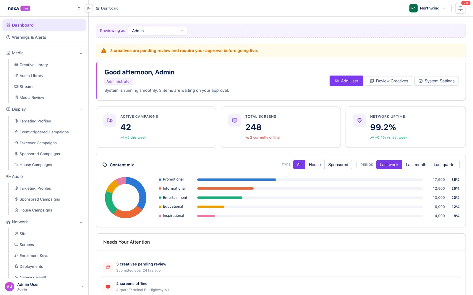
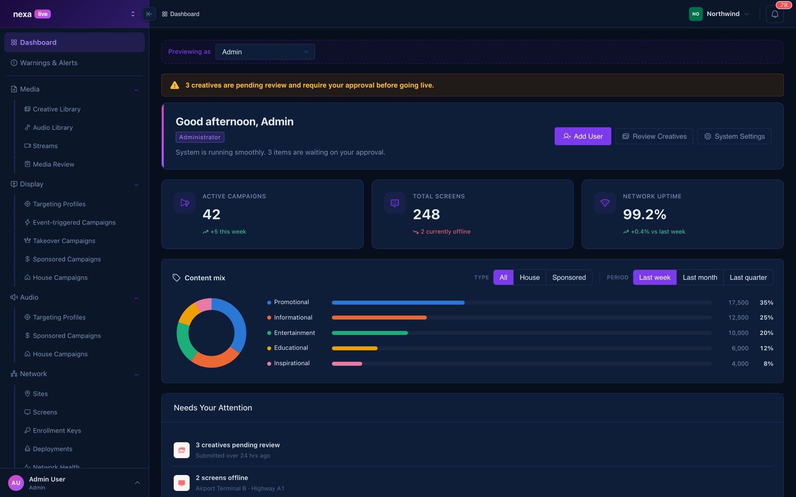
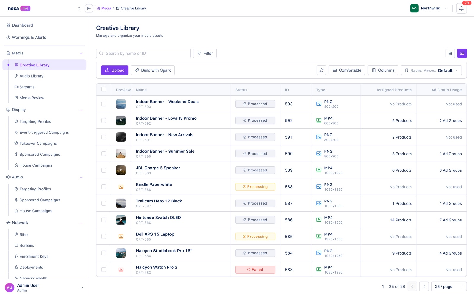
The operator's view: campaign management across every type, the creative and audio libraries, the review queue for what advertisers submit, and the physical network of sites and screens.
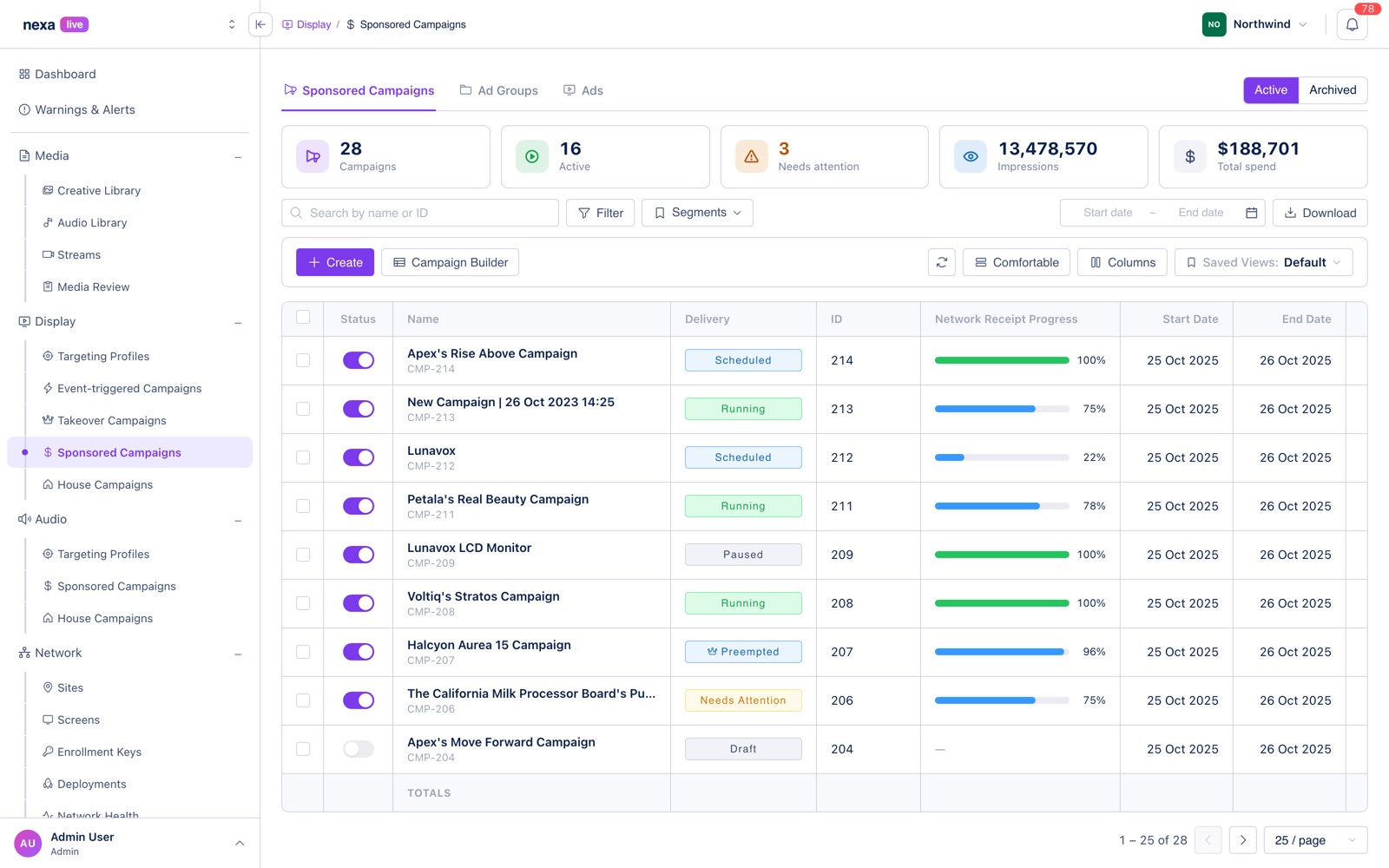
Campaign listings carry delivery state, health, and open alerts inline, so the operator sees which campaigns need attention before opening anything.
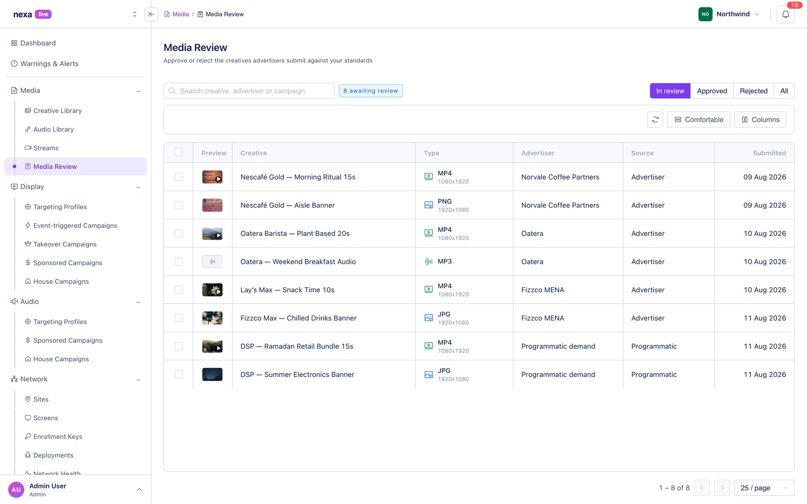
Media Review is where the two products meet: advertisers submit creatives in Nexa Ads, and the retailer approves or rejects them here against their own standards.
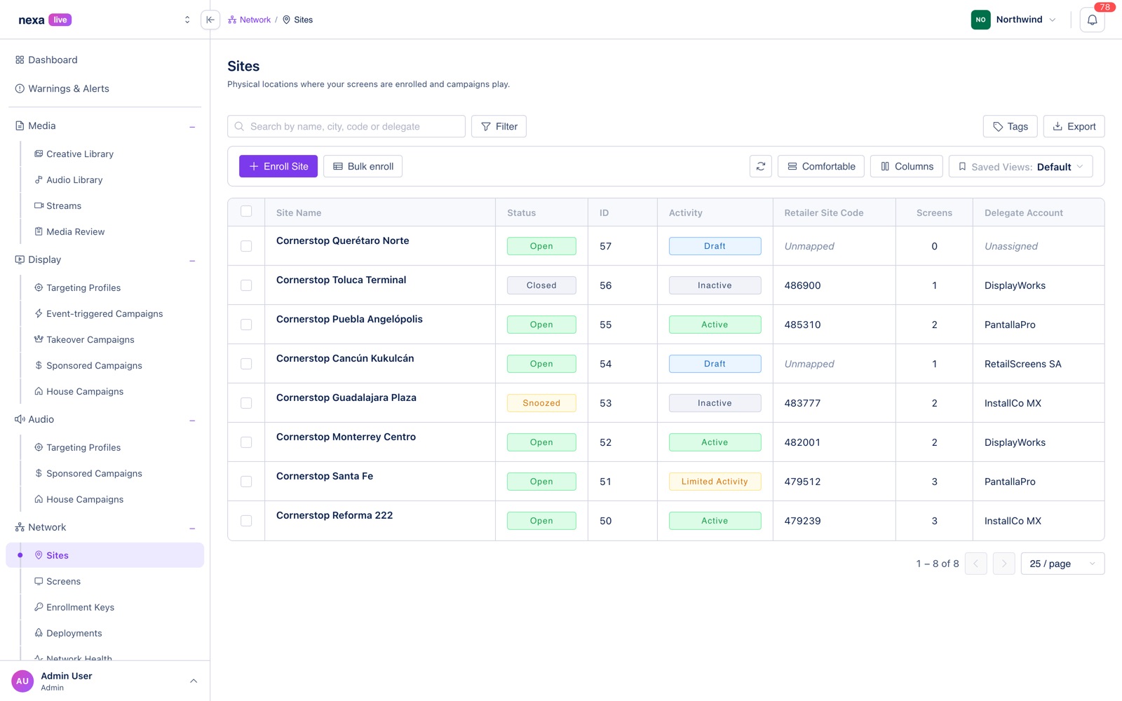
The physical inventory is modelled as a first-class hierarchy — sites, screens, and screen tags — and campaign targeting reads from it, so you can't target a site that no longer exists.
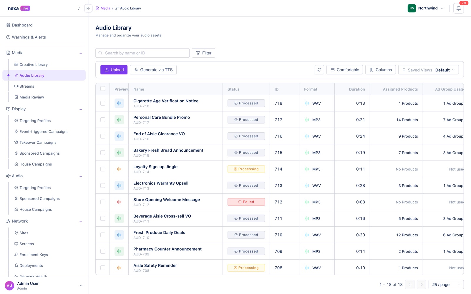
Audio is a first-class medium, not a file type bolted onto the creative library: its own library, its own player, its own campaign types and targeting profiles — because an audio ad has no screen to be placed on, and half the display vocabulary doesn't apply to it.
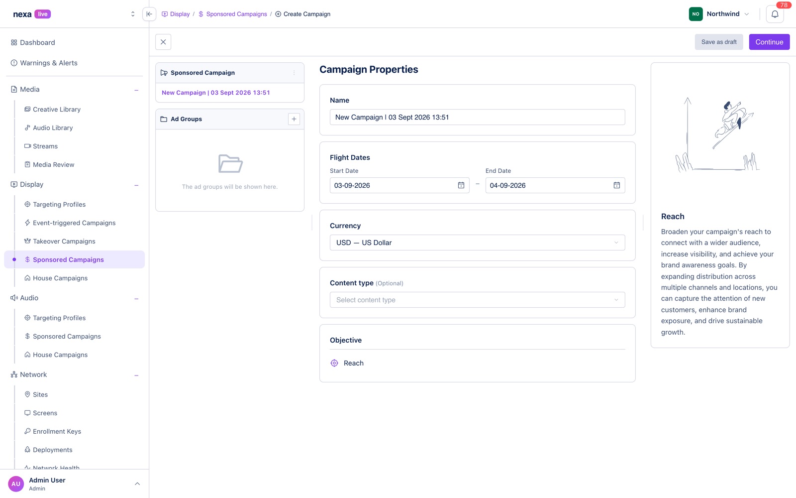
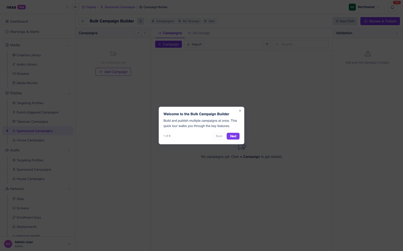
Campaign creation runs as a guided flow, with a separate bulk builder for operators who are building many campaigns at once rather than one carefully.
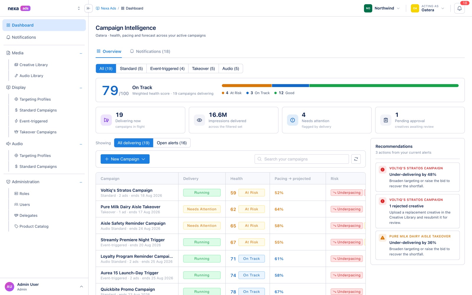
Nexa Ads — the advertiser's portal
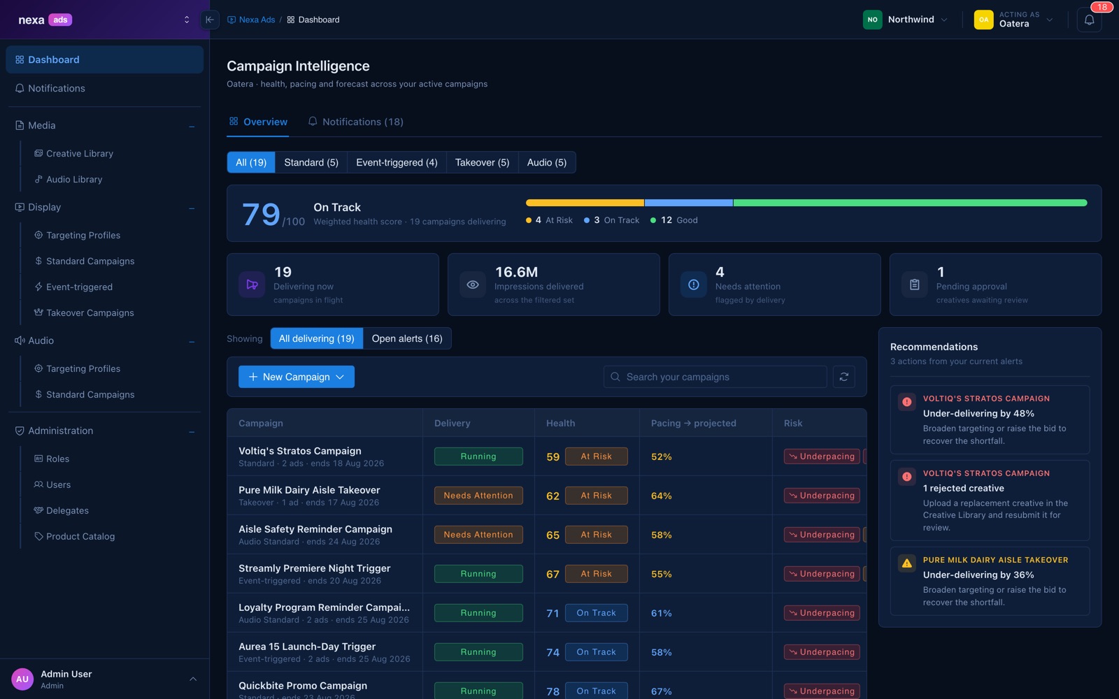
The same primitives, scoped to one advertiser and reframed around their job: get creatives approved, get campaigns delivering, know when something is wrong.
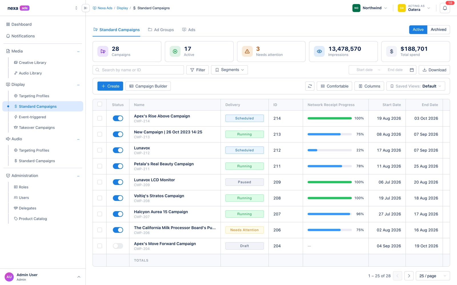
Targeting profiles are reusable audience + placement definitions, scoped per advertiser and split by medium — display and audio are separate, because an audio ad has no screen to place it on.
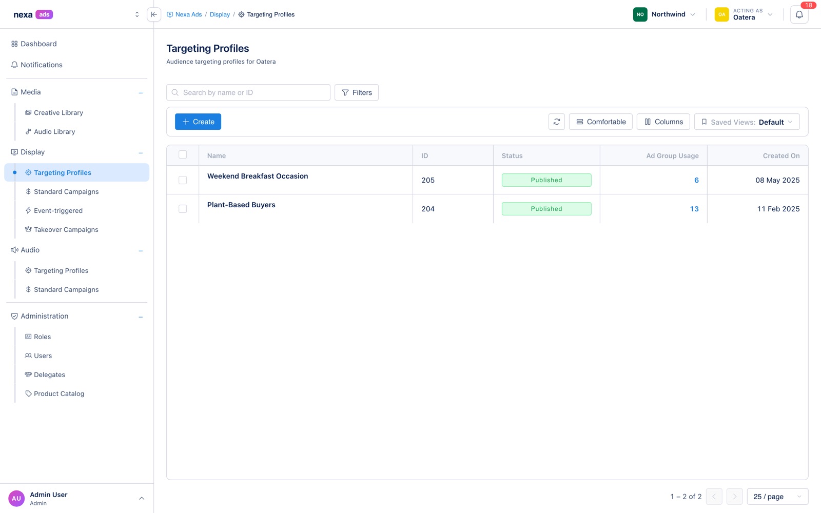
Alerts reach the advertiser as notifications, grouped by kind and scoped so one advertiser can never see another's problems.
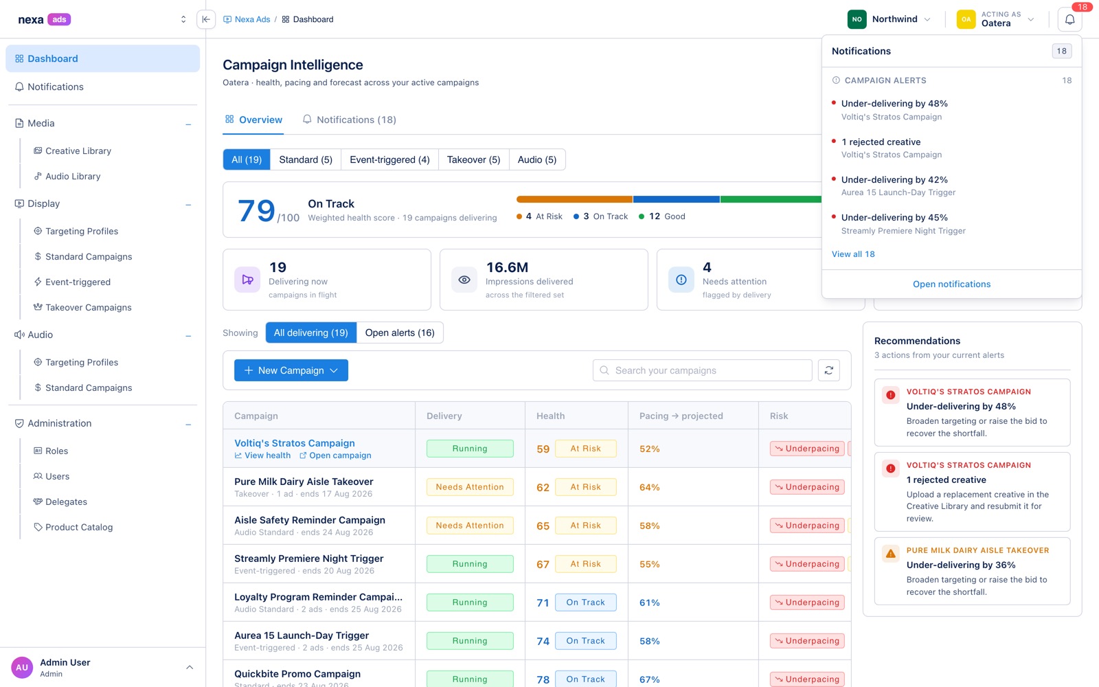
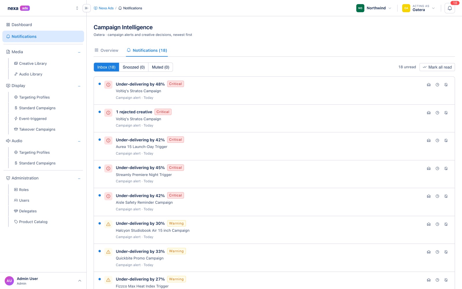
The full inbox sits behind it, where read rows stay put: a list that hides what you've already seen can't show you the same problem tomorrow, and these conditions don't resolve because someone glanced at them. Muting and snoozing exist for that instead.
The platform layer
Above both products: tenants, currencies, advertiser registry, roles, and feature flags. Thirteen flags with a route guard, so half-built features ship dark instead of living on a branch.
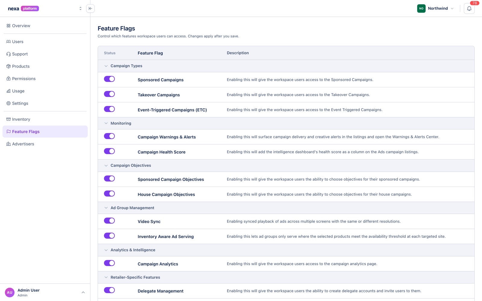
Light and dark, as one system
Theming runs entirely on CSS custom properties, with each product deriving its own accent from the
same token names. Nothing is themed twice, and nothing is hardcoded — including status colors,
which became semantic tokens (--fg-warning-default, --bg-error-subtle-default) so that "warning
orange" means one thing in both products.
| Light | Dark |
|---|---|
|  |
 |  |
|  |
How it's built
Angular 21, standalone components only. No NgModules anywhere; every component declares its own
imports. State is Angular signals throughout — services expose computed() values that components
read directly, which is what makes cross-product scoping enforceable in one place rather than
re-derived per page.
A mock data layer, deliberately. There is no backend yet. Every domain service is signal-backed and shaped so it can be swapped for HTTP without touching a component. That was a design constraint, not a shortcut: with no API to hide behind, every data shape had to be decided on purpose.
44 shared components behind one barrel export, with a rule I held to: if a piece of UI has no component, decide whether it should become one before hand-rolling markup. Storybook is the workbench (23 stories, with the accessibility addon); Figma Code Connect is configured so that implemented work resolves through real components rather than detached frames — the maps themselves are the open piece of that workstream.
A written operating system around the code. Business rules live in annotated living specs that the domain expert corrects inline; features run through a seven-phase template process (intake → requirements → design-system audit → Figma brief → design review → accessibility → handoff); larger work gets an epic document with a Jira-import CSV generated alongside it. See Specs as a conversation.
Written conventions over taste. Table behaviour is specified, not improvised — ID columns are
labelled ID, left-aligned, and never number-formatted (toLocaleString() renders identifier
12345 as 12,345, which is wrong in a way that's easy to ship and hard to notice); every table
defaults to newest-first, seeded before first render rather than after the first sort.
Deep dives
Four pieces of this project are worth reading on their own:
| Case study | What it covers |
|---|---|
| Two-sided product architecture | One codebase, two audiences: what's shared, what diverges, and the two scoping bugs that proved the boundary was real |
| A design system for two products | 45 components, semantic tokens, per-product theming, and the conventions that keep both products consistent |
| Campaign intelligence & alerts | Turning a PRD into a scoring model — pacing, creative and reach health, forecast, risk — and naming what couldn't honestly be built |
| Specs as a conversation | How I extracted business rules from a domain expert using annotated living documents instead of guessing |
Delivery timeline
| When | What shipped |
|---|---|
| Jun 2026 | Initial portal — auth, layout shell, theming, first pages |
| Jul 2026 | Campaign analytics, inventory-aware targeting, media network management, content-mix reporting |
| Aug 2026 (early) | Platform foundations: tenant currencies, advertiser registry, acting-as switcher, delegate accounts, enrollment keys |
| Aug 2026 (early) | Audio as a first-class medium — player component, library service, audio campaigns, mirrored into Nexa Ads |
| Aug 2026 (mid) | Targeting profiles with usage insights; advertiser-scoped mirror; Takeover campaigns end-to-end |
| Aug 2026 (mid) | Semantic status tokens; both products themed from one token set |
| Aug 2026 (mid) | Media Review queue and the Warnings & Alerts Center |
| Aug 2026 (late) | Campaign intelligence dashboard on a shared campaign store; health and alerts carried into every listing |
Where it stands
Both products are built and usable end-to-end on the mock layer. What's next, in order:
- —Replace the mocks. Per-service, no component changes.
- —Unblock the two deferred alert families — they need a per-day delivery plan on the campaign model and a sales-attribution source. Both are upstream of the portal, and both are named as blocked rather than quietly half-built.
- —Write the Figma Code Connect maps. The config and the workflow exist; the per-component maps don't yet.
- —Bundle budgets — the two builder flows are the largest lazy chunks and deserve a pass.
What I'd want a reader to take from it
The hard part of this project was never a screen. It was holding one distinction — the same data means different things to the retailer and to the advertiser — consistently across the architecture, the vocabulary, the scoping rules, and the copy. Every interesting decision here is a version of that, and the two bugs I found are what happens when the distinction slips.