A design system for two products, not one
44 shared components, 75 theme tokens per mode, and per-product branding derived from a single token set — plus the written conventions that keep two products consistent without freezing them.
Part of the Retail Media Network Portal project.
The requirement
Two products in one codebase — a retailer's operations console and an advertiser's self-serve portal — with a third scaffolded and a fourth planned. Each needs its own visual identity. None can afford its own stylesheet, its own table, or its own idea of what a warning looks like.
So the system has to do two contradictory things: make the products feel distinct, and make them provably consistent.
The component library
44 components behind a single barrel export: the primitives you'd expect (button, checkbox, radio, input field, textarea, select, switch, badge, modal, tabs, stepper), the data-heavy ones that carry most of the product (portal table, data table, entity detail drawer, bulk-edit modal, custom-columns modal, filter segments, KPI strip, analytics panel), and the domain-specific ones that emerged later (audio player, schedule grid, campaign health cell, campaign alerts cell, health breakdown, network receipts panel, history timeline).
The rule I held to, written into the project's own working agreement:
Build with the design system, always. Anything new must reuse existing shared components and tokens. If a piece of UI has no component, stop and decide whether it should become one — then add it to the barrel and use it.
That "stop and decide" is the load-bearing part. The failure mode of a component library isn't missing components; it's a component that exists while three pages hand-roll the same markup anyway, because adding to the library felt heavier than inlining a div.
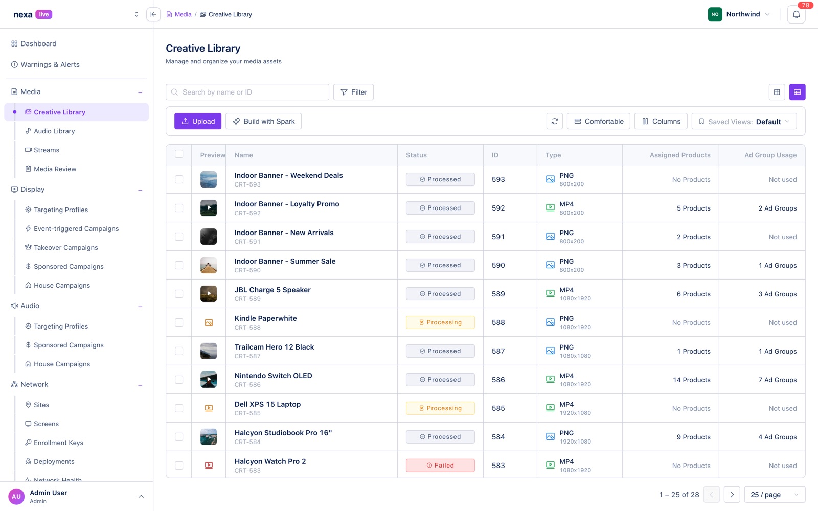
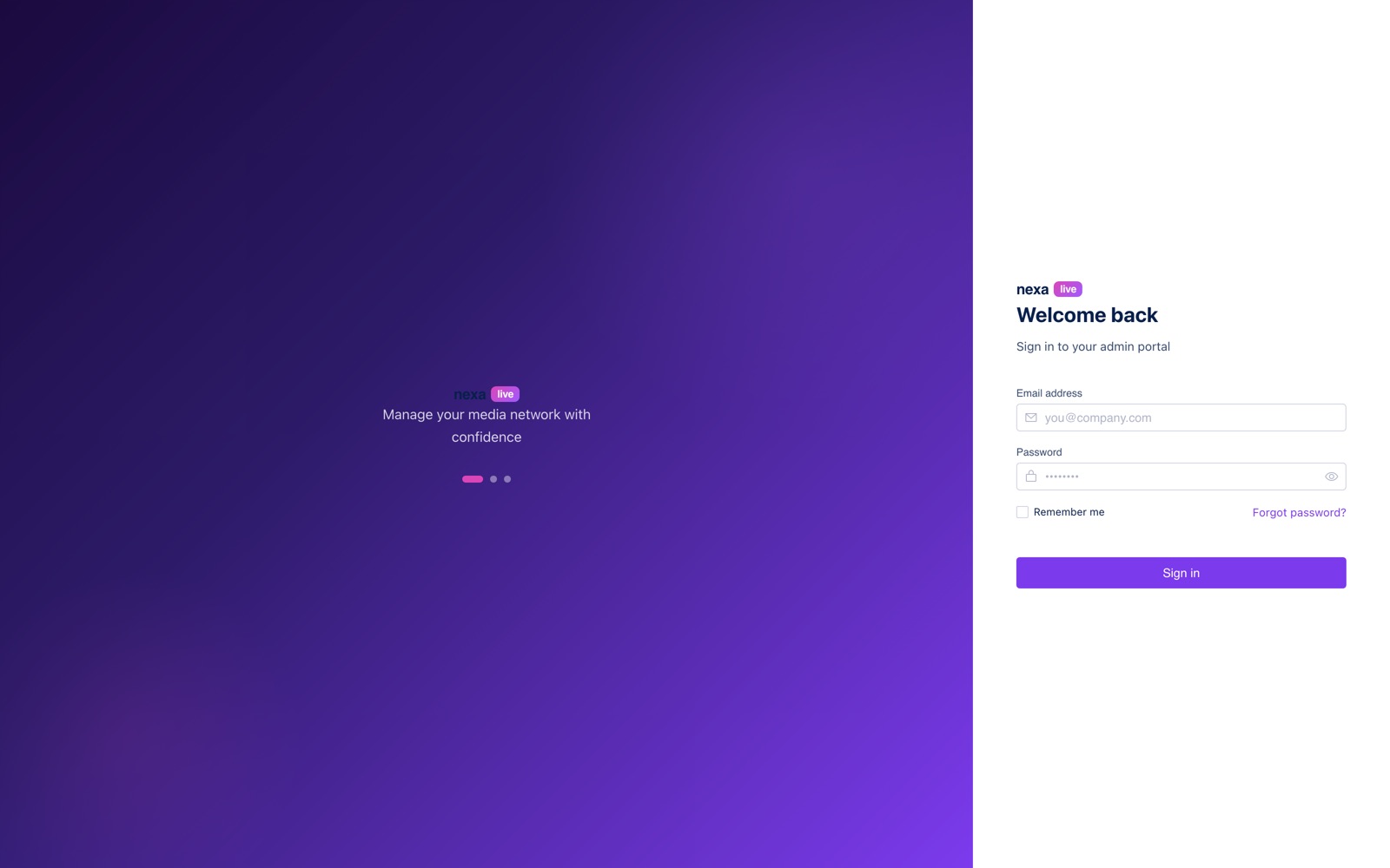
The primitives carry the least glamorous screens too, which is where a library proves itself — the login form is the same input field, button and checkbox the campaign builder uses.
Tokens, and the day I migrated the colors
Theming is entirely CSS custom properties: 75 tokens per mode, defined twice — once for light,
once for dark — and consumed by every component. Sass variables exist only for values needed at
compile time, inside calc() and media queries.
The system didn't start clean. Status colors — the greens, oranges and reds that carry delivery state, health bands and alert severity — began as hardcoded hex values scattered across page SCSS. Two products, two themes, and every "warning orange" independently chosen.
I migrated them to semantic status tokens:
--fg-warning-default      --bg-warning-subtle-default    --bg-warning-solid-default
--fg-error-default        --bg-error-subtle-default      --bg-error-solid-default
--fg-success-default      --bg-success-subtle-default    --bg-success-solid-default
--fg-info-default         --bg-info-subtle-default       --bg-info-solid-default
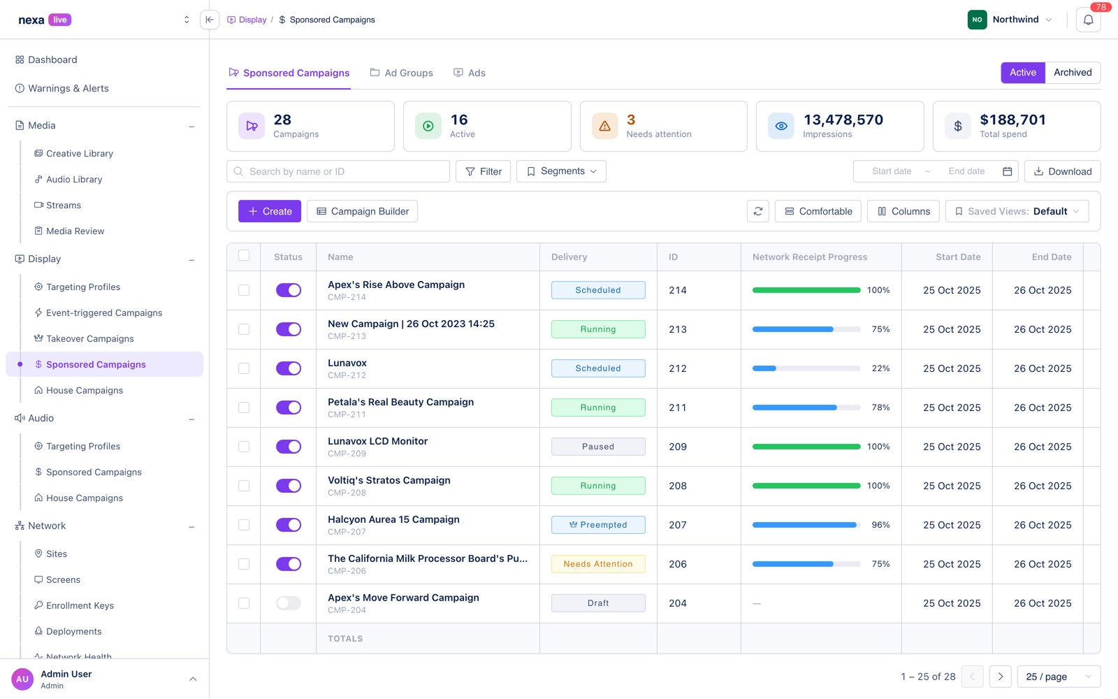
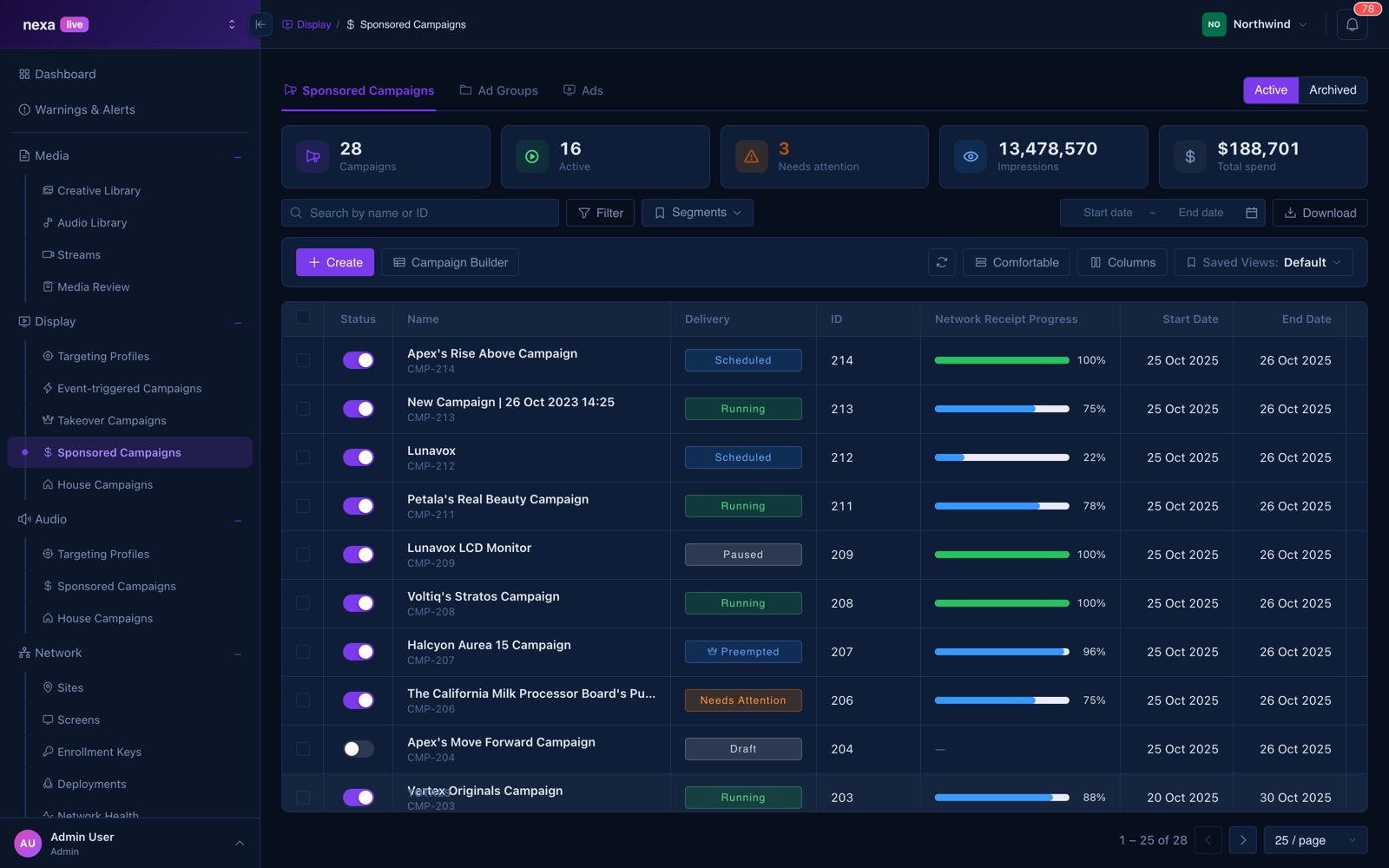
Naming them by role rather than by hue is what made the next feature cheap: when alert severity arrived, "critical / warning / info" already had a color contract in both themes. Nothing had to be picked, and nothing could be picked inconsistently.
One deliberate exception: two builder pages shipped with hand-tuned greens and oranges that didn't map onto the token scale, and forcing them would have visibly changed screens people were already using. I kept those exact values and left a note saying why. A system that can't record an exception gets worked around instead.
| Light | Dark |
|---|---|
 |  |
Per-product branding from one token set
Each product gets its own accent by overriding a handful of tokens under a data-product attribute
on <html>, set from the route. The retailer product is violet (#7C3AED); the advertiser product
is a sky-blue derived from its own logo gradient.
[data-product='ads'] {
  --primary: #1a7fe0;
  --primary-hover: #0d52a0;
  --gradient-start: #1abcfe;
  --gradient-end: #a259ff;
  …
}
The interesting part is a cascade problem that only shows up with two axes of theming. Four sidebar
tokens are defined by both the theme blocks and the product block. Because the product block is
emitted last and matches with equal specificity, it beat [data-theme='dark'] — and painted a
near-white hover state onto the dark sidebar.
The fix is a second, more specific block for the intersection:
[data-theme='dark'][data-product='ads'] {
  --sidebar-item-hover: #162a48;
  --sidebar-item-active-bg: rgba(26, 127, 224, 0.2);
  …
}
Two themes × four products is eight combinations, and the only way that stays sane is to treat the intersections as first-class rather than hoping specificity sorts itself out. Both blocks carry comments explaining exactly which tokens overlap and why — because the symptom (one wrong hover color, in one product, in one theme) is far away from the cause.
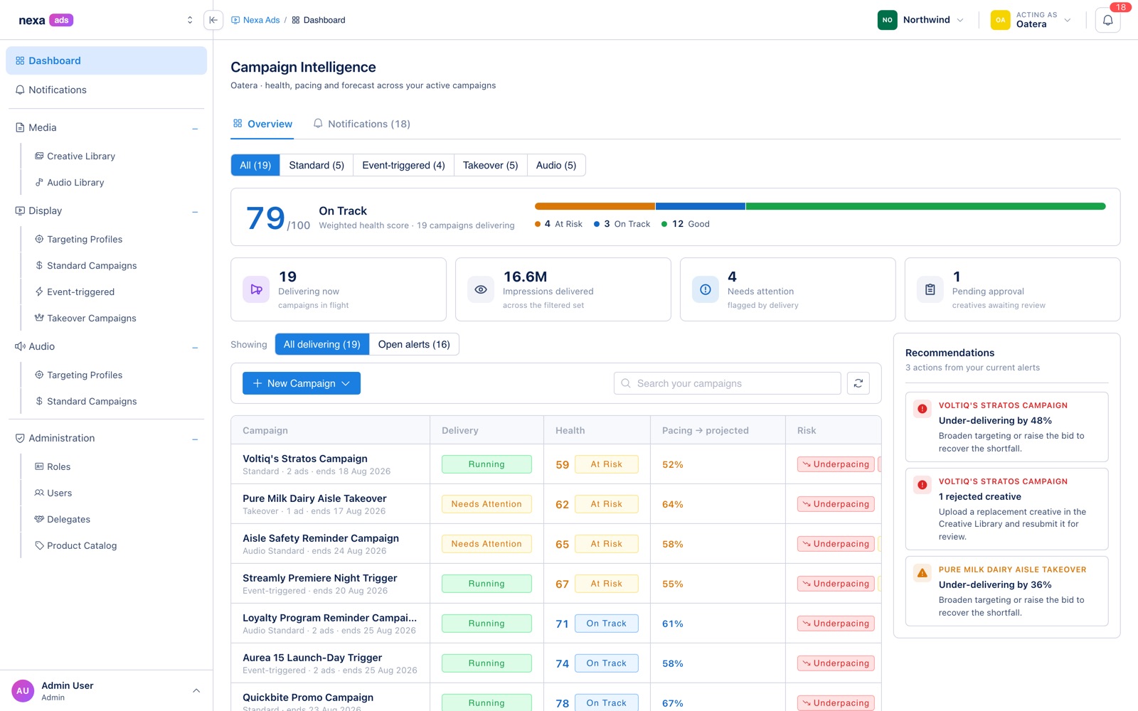
Conventions as part of the system
Some consistency can't be delivered by a component, only by a rule. These are written into the project's guidance file, where they're enforced in review rather than remembered:
ID columns. Any identifier column is labelled ID (not Id), left-aligned, and never typed as
a number. The number formatter runs toLocaleString(), which turns identifier 12345 into
12,345 — wrong in a way that's easy to ship and hard to notice. Quantity and currency columns
stay right-aligned; identifiers don't.
Newest-first, by default. IDs are assigned sequentially on create, so id-descending is
creation order. Every table seeds its sort stack with [{ key: 'id', direction: 'desc' }] from the
start — not [] — so the newest row is first on initial render, not only after the user clicks a
header.
Dead CSS is part of the change. Replacing hand-rolled markup with a component includes deleting the styles it made redundant, including in the global stylesheet. Otherwise the system accumulates a second, invisible design system underneath the real one.
Where the design side stands
Storybook, with 23 component stories and the accessibility addon, as the workbench for building a component outside the page that needs it.
Figma Code Connect is configured — parser, include paths, and the workflow for mapping a published Figma component to its code counterpart — so that implemented work resolves through real components rather than detached frames. The maps themselves aren't written yet; that's the open piece of this workstream, and the reason I'm careful to describe the loop as set up rather than closed.
What I'd do differently
Tokenize status colors on day one. The migration was mechanical but touched everything, and every screen built before it had to be re-checked in both themes. The cost of doing it late is entirely avoidable.
Write the conventions down earlier. The ID-column and default-sort rules each came from noticing the same mistake twice. They're a page of text that prevents a class of inconsistency no component API can prevent — and I only wrote them after paying for them.
Treat theme intersections as designed states. Light/dark × four products isn't eight variations to test at the end; it's eight states with owners. The dark-sidebar bug was cheap to fix and would have been free to avoid.