CityDal — Brand Identity
Complete brand guidelines for a city-discovery app — logo, color system, typography, patterns, iconography, stationery, merchandise, and social templates, all shipped as Version 1.0 in July 2023.
Context
CityDal is a local discovery platform built around a single idea: reveal the city's treasured mysteries. Its purpose is to connect people with local businesses — helping customers save time and money while giving businesses a direct channel to reach the right audience. The CEO and founder, Saleh Al Hazbi, framed the brand vision as "creating innovative technologies that enhance customers' experience and empower business to thrive."
That vision needed a visual language to match — something that felt energetic and approachable without losing the trust signals a B2B-facing platform requires. My job was to build that system from the ground up and document it in a set of brand guidelines that any team member, agency, or print vendor could pick up and use without ambiguity.
The Logo
The logomark is a stylized fusion of the letters C and D — a circular arc and a downward hook that together form a shape suggesting both a location pin and a lens. The metaphor is intentional: CityDal surfaces what's around you, reveals what you might have missed.
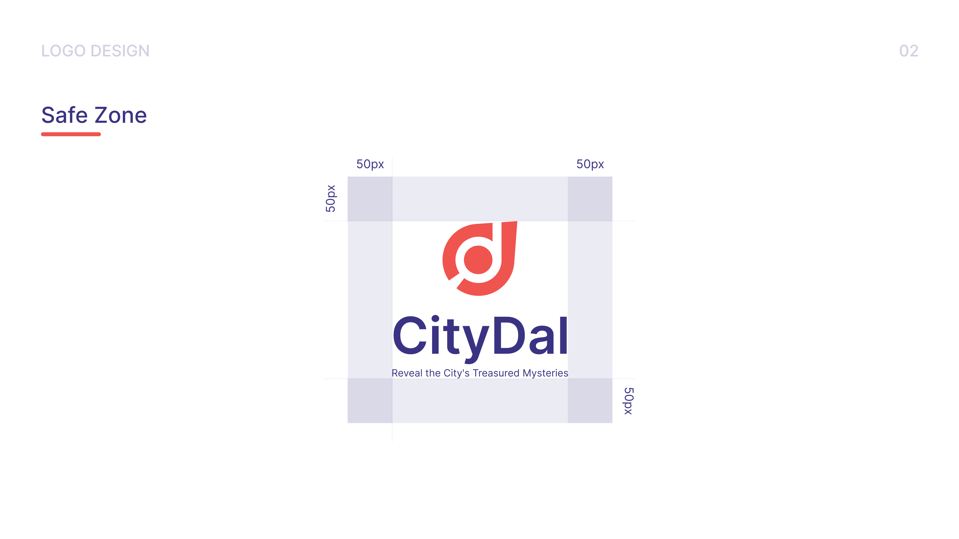
The wordmark pairs the icon with the name in Inter Bold, keeping the geometry tight. A 50px safe zone on all sides is specified in the guidelines to ensure the mark never competes with surrounding content — a rule that matters most in the app's UI and co-branded contexts.
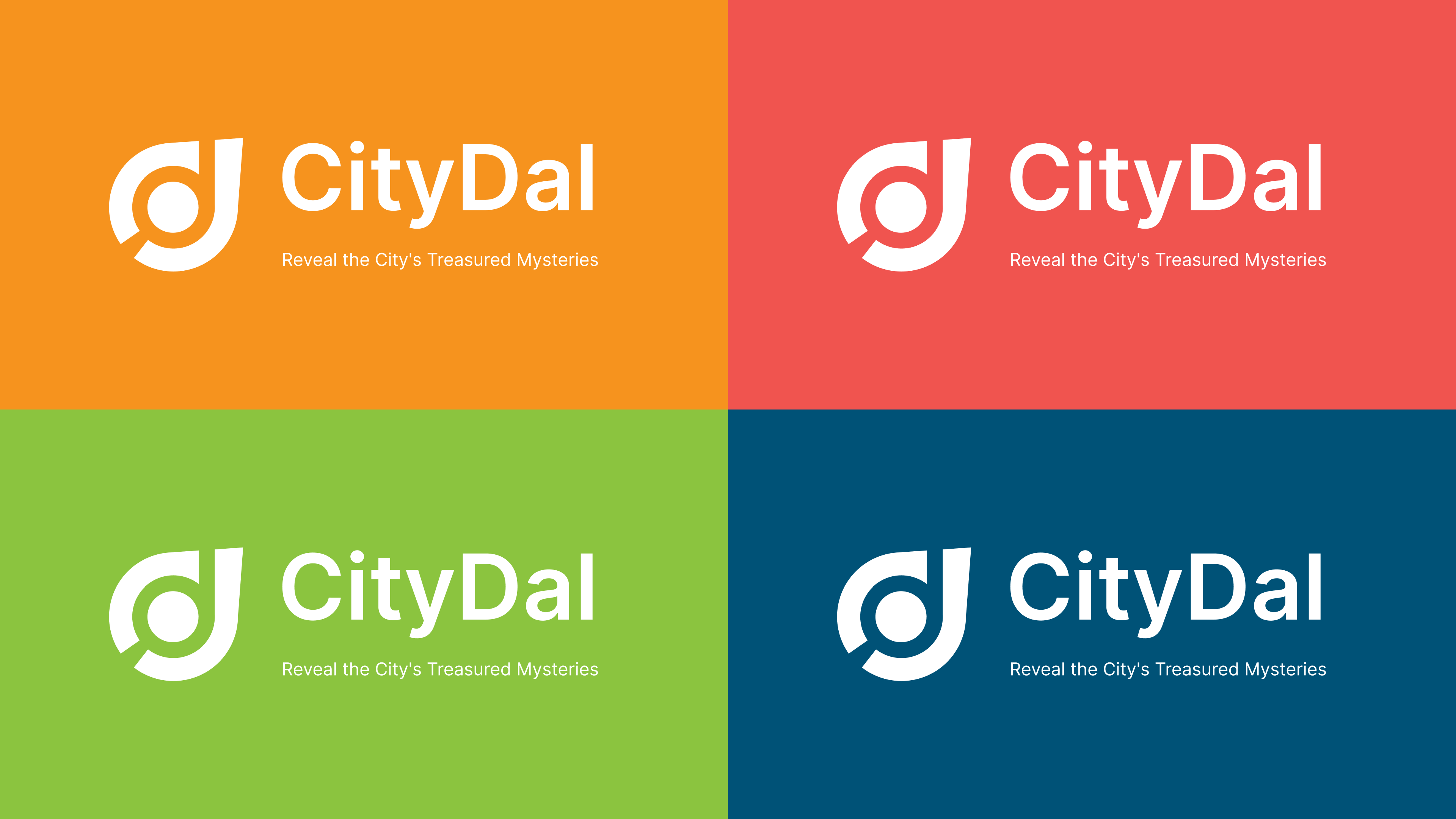
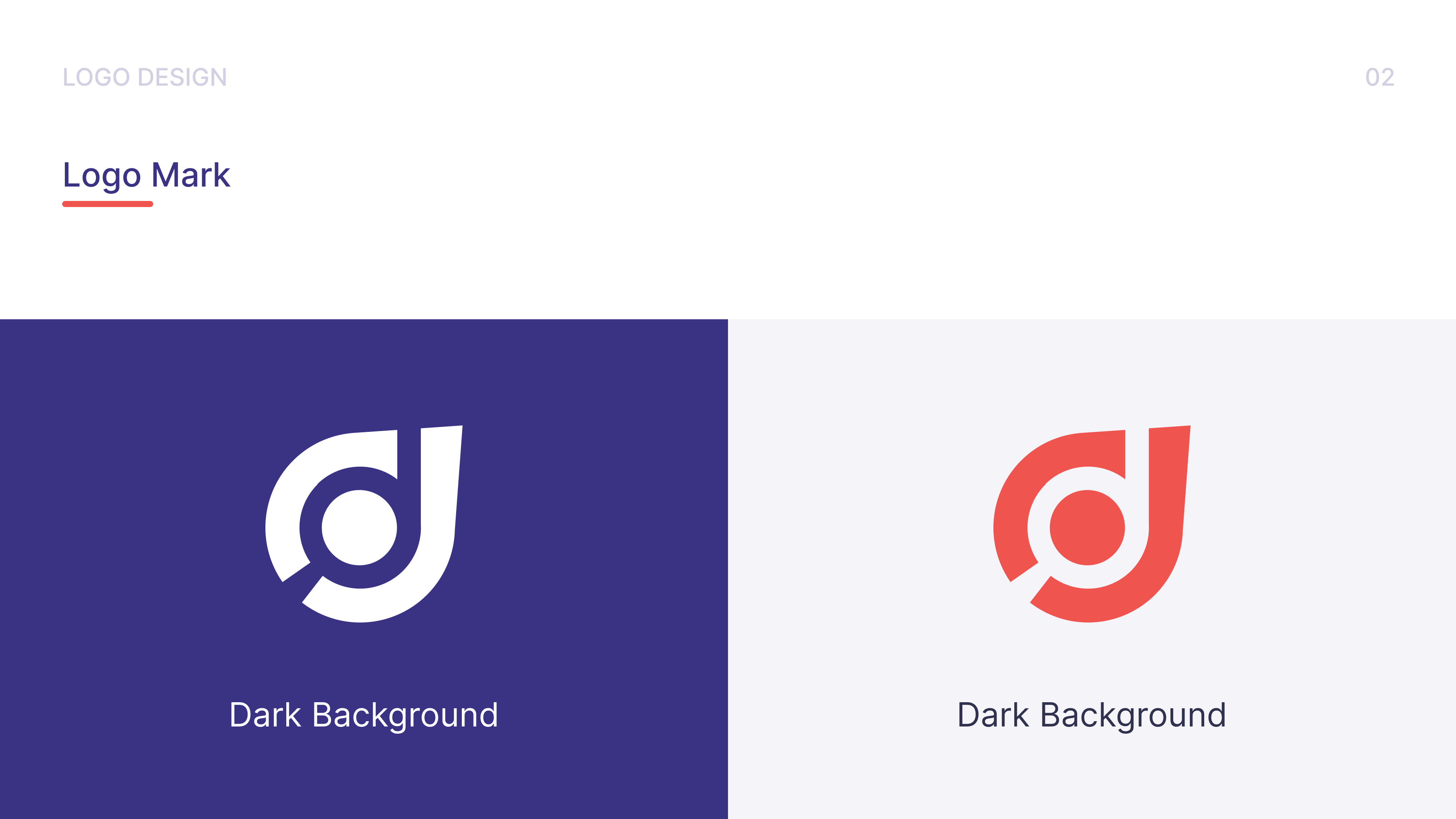
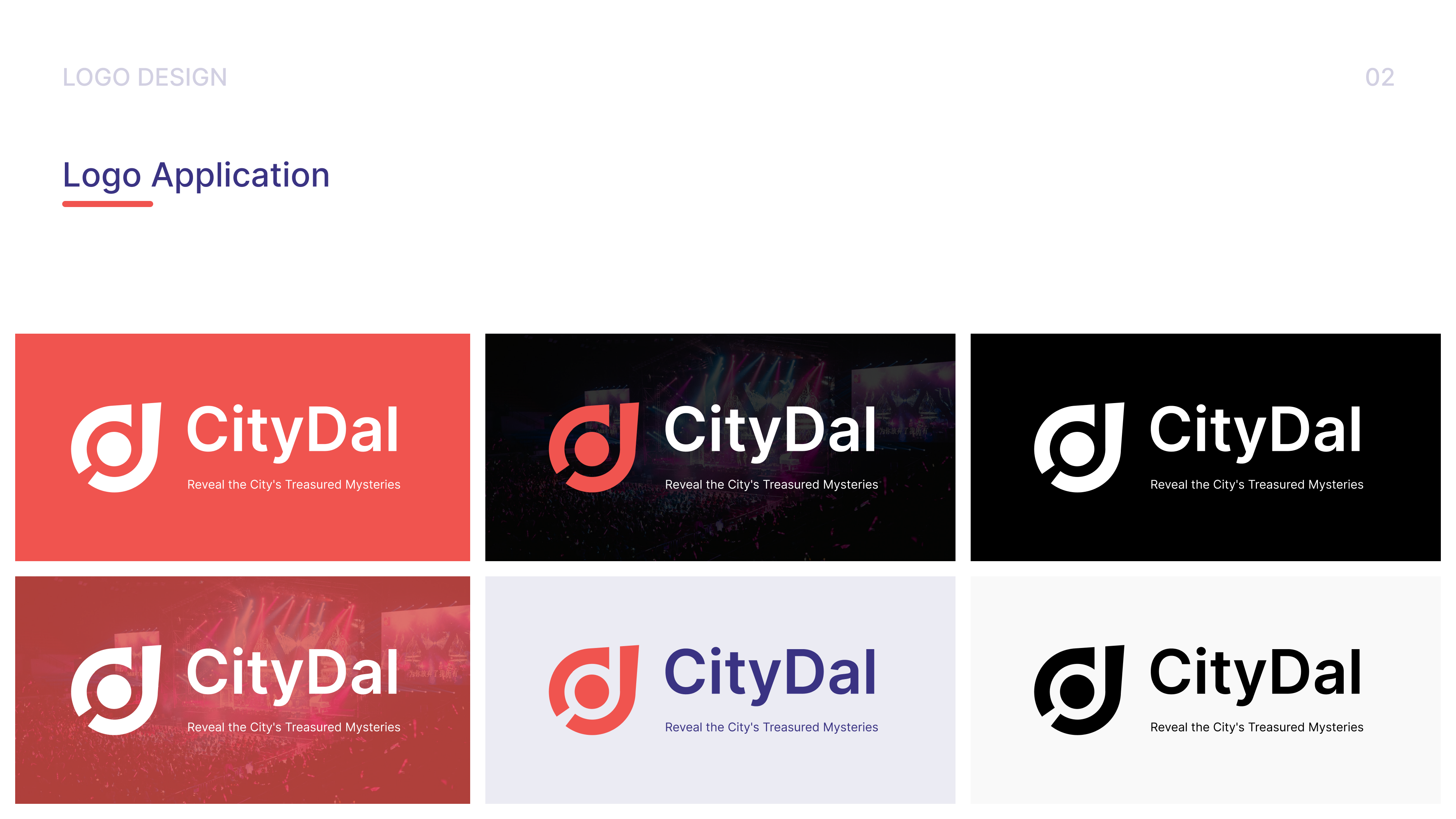
The logo was tested across six real application contexts — brand-colored backgrounds, photography, white, and black — to confirm it holds at every contrast level before the guidelines were signed off.
Color System
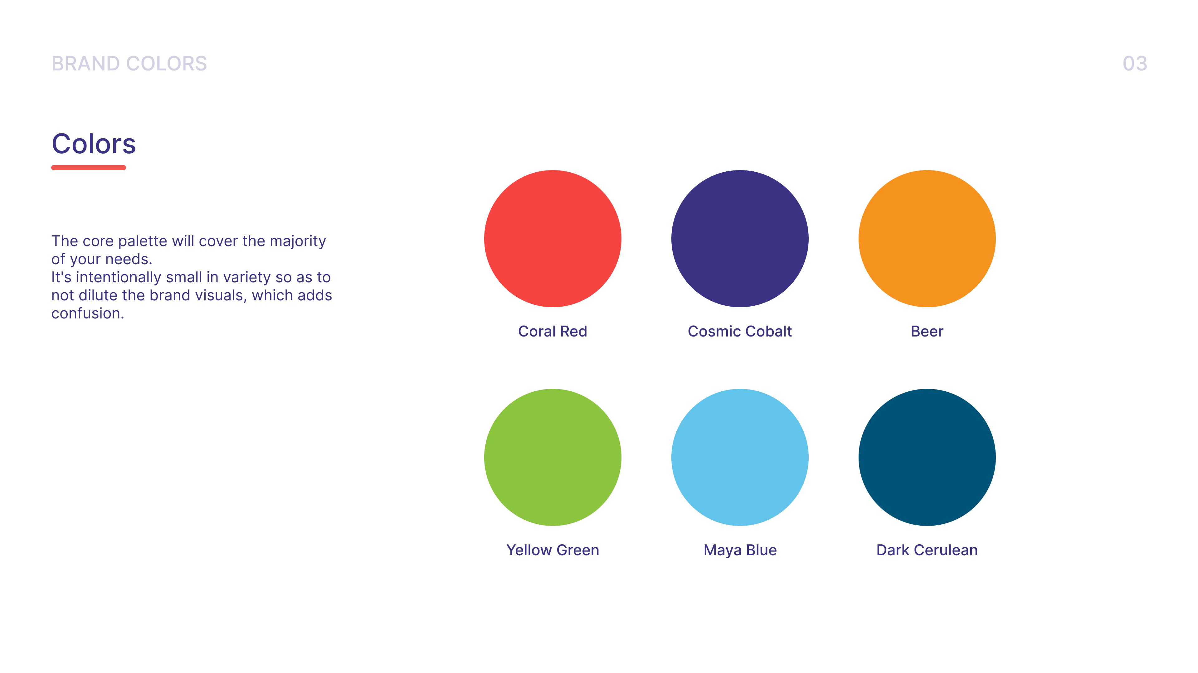
The palette is deliberately wide for a brand at this stage. Six named colors — Coral Red, Cosmic Cobalt, Beer (amber), Yellow Green, Maya Blue, and Dark Cerulean — give CityDal the expressive range it needs for a consumer-facing discovery product, where each city category or content type might carry its own accent.
The guidelines note that the palette is "intentionally small in variety so as not to dilute the brand visuals" — which sounds contradictory with six colors, but the logic holds: these six are fixed and named. There's no room for improvisation, which is where brand consistency actually breaks down.
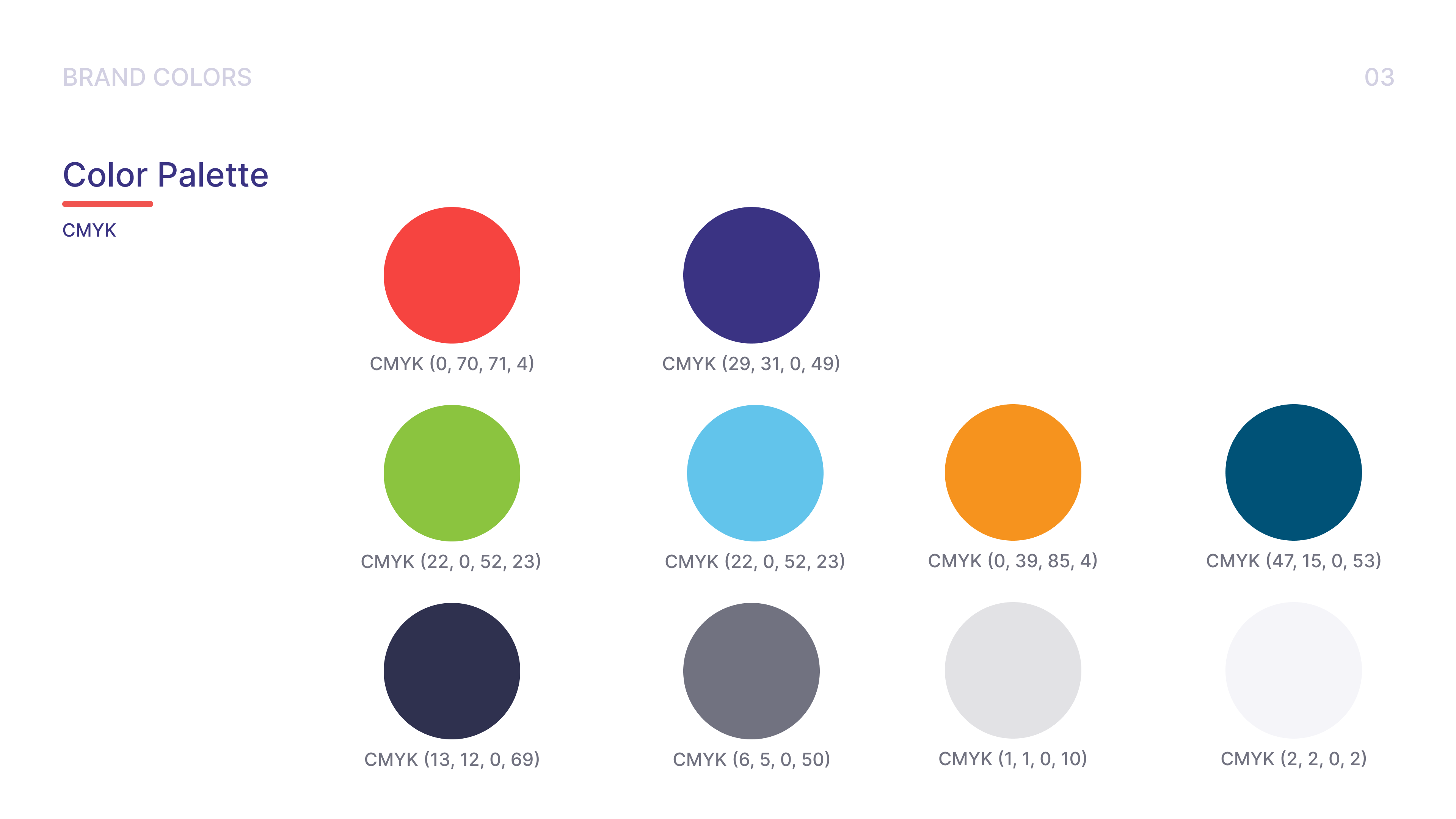
Full CMYK values are documented for print production — the kind of detail that gets skipped in digital-only brand work and becomes a problem the moment the first batch of business cards or packaging comes back wrong.
Typography
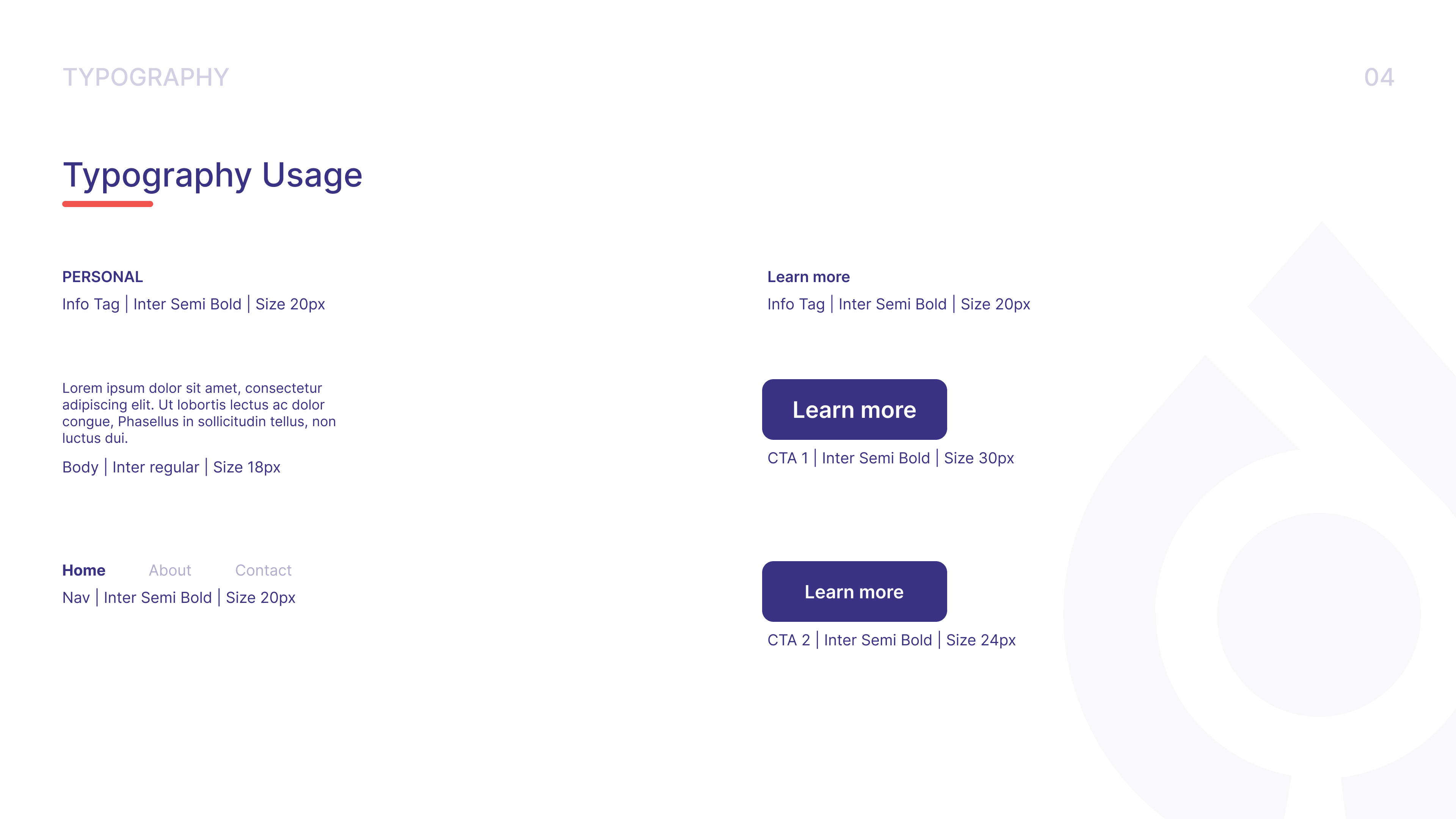
Inter is the sole typeface — Regular, SemiBold, and Bold. The choice is practical: Inter is free, legible at small sizes, and already optimized for screens. Using a single family with three weights keeps the system coherent without restricting expressive range.
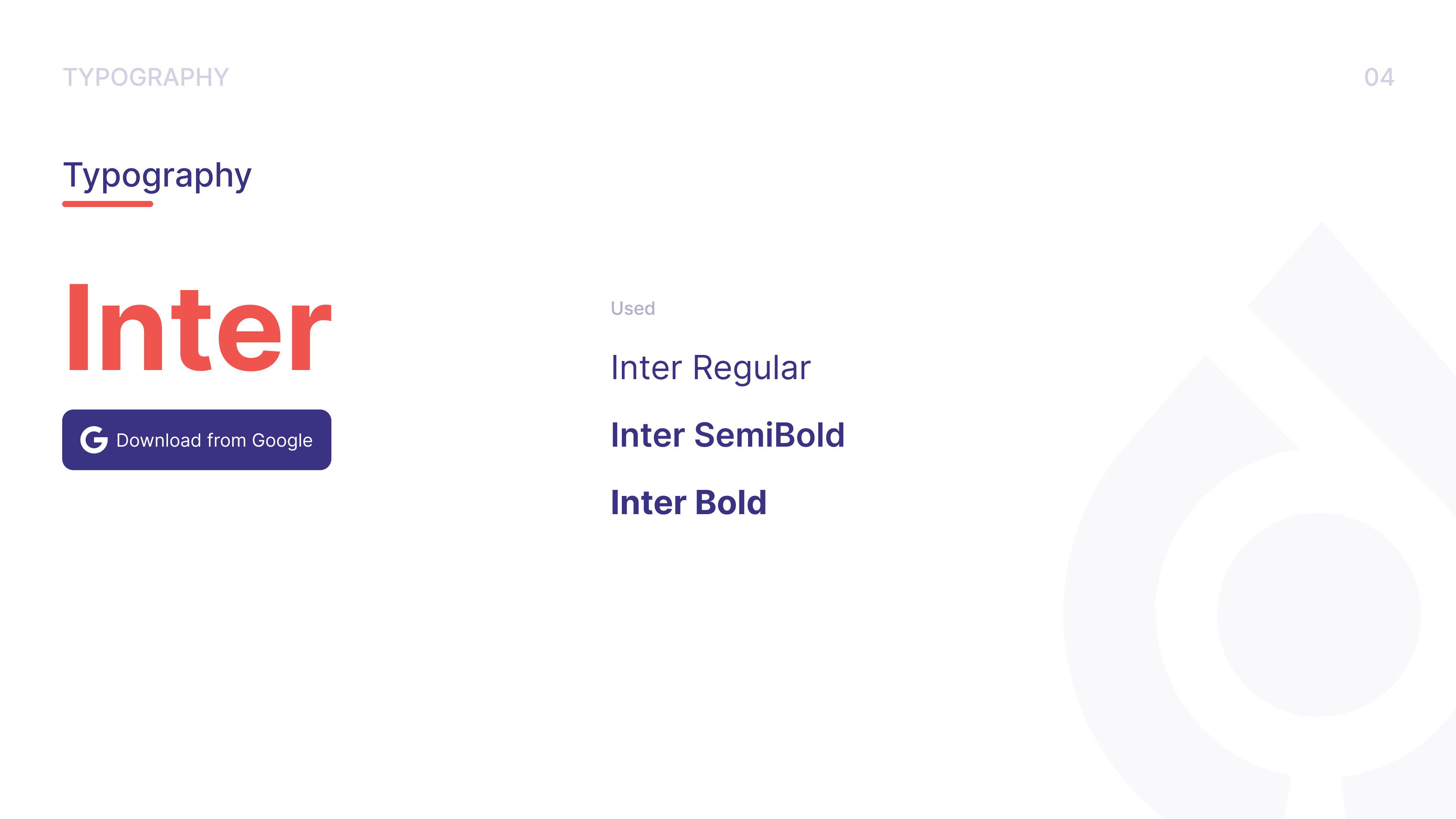
The usage guide maps weights to specific UI roles: body copy at 18px Regular, navigation at 20px SemiBold, CTAs at 24–30px SemiBold. That level of specificity matters because it prevents the gradual drift that happens when individual designers make local decisions — "this heading could be a bit bigger" — and the system loses cohesion over a few months.
What the System Covers
The Version 1.0 guidelines document twelve chapters: Introduction, Logo Design, Brand Colors, Typography, Photography, Brand Voice, Pattern, Iconography & Illustrations, Stationery, Merchandise, Brand Stuff, and Social. That scope — from the logomark construction rules through to social media templates — is what separates a brand identity from a logo file. It gives CityDal a system that scales.
Reflection
Brand identity work lives or dies by how well it holds up in the hands of people who weren't in the room when it was made. That informed every decision here — the safe zone spec, the CMYK documentation, the explicit type scale, the named palette. A designer picking this up a year from now should be able to apply it correctly without guessing.