DesignGuard — AI-Powered Design QA
Catching design inconsistencies before they reach the developer.
How I got tired of catching the same mistakes and built something that does it for me.
The Problem
We had a design review process at Intouch. On paper, it was the QA gate — the moment before handoff where we'd catch anything that slipped through. In practice, it was inconsistent. Reviews happened when there was time, got skipped when there wasn't, and relied entirely on whoever was in the room to catch what was wrong.
The screens that shipped with problems were never the ones we planned carefully. They were the ones added at 6pm the day before a sprint closed. Last-minute additions under deadline pressure — where the 8px grid becomes a suggestion and padding values get eyeballed instead of checked.
The inconsistency that kept slipping through wasn't dramatic. It was padding — inside buttons and form fields. A 12px value where the system said 16px. An input field with 8px vertical padding where every other field had 12px. Nothing broken. Nothing that triggered a bug report. Just slightly off in a way a user can't name but absolutely feels. The interface looked a little unpolished. A little untrustworthy.
That matters more than it sounds. In a product where I built and own the design system, a visual inconsistency isn't just a bug — it's a credibility problem. The rules existed. The components were documented. The inconsistency made it through anyway.
My Role
Solo builder. I designed the tool, defined the rules, wrote the code, and ran the first real test against a live Figma file. This was a personal project built outside working hours — not a team initiative. The engineering background helped. Knowing how to think about a system in terms of inputs, rules, and outputs made the architecture feel natural.
The Hard Decision
The obvious fix was a checklist. We tried it. The problem is that a checklist requires the same focused attention as the review it was meant to replace — and that attention is exactly what's missing at 6pm before a sprint closes. A checklist doesn't catch anything if the person running it is the same person who made the mistake.
So I considered two directions:
Option A: A rules-based linter — a script that checks spacing values, color tokens, and font sizes against a fixed list of allowed values. Fast to build. Deterministic. But brittle. It would flag every 12px spacing value even if it was intentional — an exception documented in the system for a specific component. It couldn't tell the difference between a mistake and a decision.
Option B: AI-assisted analysis on top of rule-based detection — run the deterministic checks first to find candidates, then pass the results to Claude to apply judgment: Is this a systemic pattern or a one-off? Is this likely to be intentional or an oversight? What's the probable visual impact on the user?
I went with Option B. Not because it was faster to build — it wasn't. But because the goal wasn't to flag every technical violation. The goal was to surface the issues that actually matter before a developer touches the file. That requires judgment, not just pattern matching.
What We Built
DesignGuard is a Node.js CLI tool that takes a Figma file URL, pulls the full file JSON via the Figma REST API, runs five design QA rules against every node in the file, passes the flagged issues to Claude for pattern analysis and prioritization, and outputs a structured QA report in markdown.
The five rules it checks
- —Spacing off-grid — any padding, gap, or margin value not divisible by 8 (4 is allowed as a valid half-step)
- —Hardcoded colors — fill or stroke values not referencing a Figma variable or style
- —Font size off-scale — type sizes outside the defined scale: 12, 14, 16, 20, 24, 32, 40, 48
- —Unnamed layers — frames or components still on default names like "Frame 47" or "Group 12"
- —Button/input padding inconsistency — interactive elements where padding values don't match across similar nodes
The AI layer does three things the rule engine can't
- —Groups related violations by pattern — "spacing issues are concentrated in the onboarding flow, not distributed evenly"
- —Separates systemic problems from one-off mistakes — "this suggests the 8px rule isn't enforced during fast-iteration sprints, not that a single designer made an error"
- —Prioritizes by likely visual impact — because not every rule violation is equally visible to the user
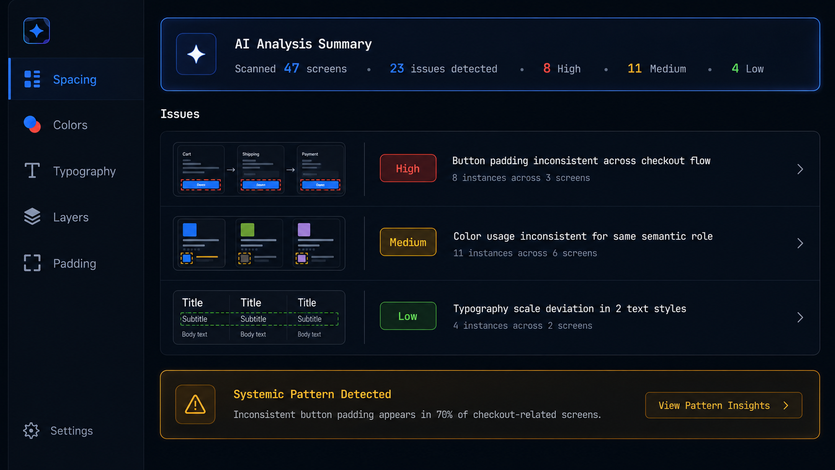
The output: a prioritized QA report (high / medium / low) with a plain-English explanation for each issue group, plus a raw issue log for reference. Runs in under 60 seconds on a file of average complexity.
Stack: Node.js · Figma REST API · OpenRouter API · Llama 3.1 8B (free, open-source)
Repo: github.com/aashour-gd/designguard
The Result
I ran DesignGuard against a real Figma file — a product I'd been working on under sprint pressure. The results were honest in a way that was slightly uncomfortable.
It flagged 23 issues. Of those:
- —8 were high priority — spacing violations inside interactive components, the exact class of error that had shipped before
- —11 were medium priority — unnamed layers and off-scale font sizes that weren't visually breaking but would cause friction in dev handoff
- —4 were low priority — edge cases the system itself is ambiguous about
The two things that stood out in Claude's analysis:
- —The high-priority spacing violations were all in screens added in the last two days of the sprint — exactly the pattern I'd described in the problem brief. It wasn't random. It was structural.
- —Three of the unnamed layer issues pointed to a component that had been duplicated and modified outside the main library — a systemic flag, not a careless mistake.
Manual QA of that file would have taken 90+ minutes and likely missed the pattern. DesignGuard caught it in 47 seconds and told me why it was happening, not just that it was happening.
What I Learned
AI doesn't replace rules — it makes rules useful.
A pure linter gives you a list of violations. That list is often too long to act on and too blunt to trust. The moment I added Claude's analysis layer on top, the output went from "here are 23 problems" to "here are the 8 things that will actually affect quality, and here's why they're happening."
The other thing I learned: the real bottleneck in design QA isn't catching issues. It's having the confidence to act on them under time pressure. A tool that surfaces patterns and explains their impact gives you something to show a PM when you push back on a deadline. "We have 8 spacing violations concentrated in the onboarding flow" is a different conversation than "I think something looks off."
That's the version of QA that actually changes what gets shipped.
One more thing I didn't expect to learn: the AI layer doesn't need to be expensive. The same analysis runs on a free open-source model via OpenRouter, which means any designer can use this tool at zero cost. Good judgment doesn't have to come with a bill.